Plots and graphs are a very important part of a research paper and they often do a good job of conveying the results to the reader. Thus, it is very important that they look visually appealing.
One way to generate plots is to use matplotlib with Python, which makes things a lot easier. However, there are a few problems with it (but can be solved):
- matplotlib’s default font does not look very good mixed with LaTeX fonts,
- Images generated with matplotlib cannot be directly used with the screen clipping tool: this results in blurry images.
An example of what I am referring to (this was taken from a report written in LaTeX):
Solving the Problem 1: Using LaTeX compatible fonts
Matplotlib supports using LaTeX fonts in plots, and this can be done with a few lines of code (this will require LaTeX installed on the system beforehand (more info)):
import matplotlib.pyplot as plt

# x axis
ks = range(5, 14)

# y axis
results = [0.77627718442, 0.779758651376, 0.779831336605, 0.780332508531, 0.780986909681, 0.803343901758, 0.804763267426, 0.799750946218, 0.801493061947]

# use LaTeX fonts in the plot
plt.rc('text', usetex=True)
plt.rc('font', family='serif')

# plot
plt.plot(ks, results)
# set labels (LaTeX can be used)
plt.title(r'\textbf{Mutual Information Feature Selection}', fontsize=11)
plt.xlabel(r'\textbf{Best K features}', fontsize=11)
plt.ylabel(r'\textbf{AUC Score on split11 Dataset}', fontsize=11)
plt.show()
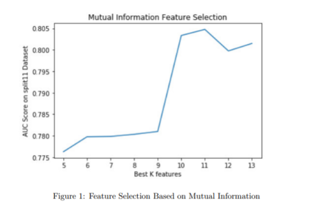
Here is the end result on the PDF after clipping and saving as PNG:
Looks way better! However, one problem is that it still is an image. If you scale the PDF, then the blurriness of the image will haunt you!
Solving the Problem 2: Saving the Plot as PDF
No matter how good the image looks, it will not be clear when the PDF is scaled and the text on the image will not be selectable. As a solution, we can save the plot as PDF and include in LaTeX:
# get the figure
f = plt.figure()

# plot
plt.plot(ks, results)

# set labels (LaTeX can be used)
plt.title(r'\textbf{Mutual Information Feature Selection}', fontsize=11)
plt.xlabel(r'\textbf{Best K features}', fontsize=11)
plt.ylabel(r'\textbf{AUC Score on split11 Dataset}', fontsize=11)
plt.show()

# save as PDF
f.savefig("fs_mi.pdf", bbox_inches='tight')
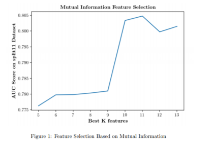
Then, the saved image easily can be imported in the LaTeX document with:
\begin{figure}[h]
\centering
\includegraphics{figures/fs_mi.pdf}
\caption{Feature Selection Based on Mutual Information}
\label{fig:fs_mi}
\end{figure}
Here is the end result for comparison (the one with selectable text stays clear and crisp on the PDF even if the PDF is scaled):


Wao, amazing! Thank you for your explanation. I’m currently writing my master thesis, and I’m thinking to start using this software mixed with your tricks. Will try and come back to tell you.
LikeLike
A question, for which Matplot are those tricks? 2 or 3?
LikeLike
You can combine them. The final plot is https://ercanozturk.org/2017/12/16/python-matplotlib-plots-in-latex/comment-page-1/#jp-carousel-433
LikeLike
Hey Fernando! Glad to hear that, I hope the post helps!
LikeLike
I have another question, it works perfectly on mi .tex file, only problem is it is a bit big, do you have any code to make it smaller please? I was trying with other pages information but definitely it doesn’t work!
LikeLike
You can change the size of the figure with regular LaTeX such as:
\includegraphics[width=3cm, height=4cm]{figureToAdd.pdf}LikeLike